Your Prospecting Powerhouse
Genie was created as a new prospecting app for PayCompass agents. The concept was
to give the idea of a helping hand for our agents whenever they needed it, much like a magical genie. Genie brought everything into one place, eliminating the need to dig
through different resources while providing support throughout real deals and in real time.
The challenge was taking the familiar idea of a genie and pushing it beyond the traditional lamp-and-magic visual.I wanted Genie to have a personality and identity of its own, something that felt helpful, energetic, and approachable.
Logo
Primary Logo
Primary Favicon

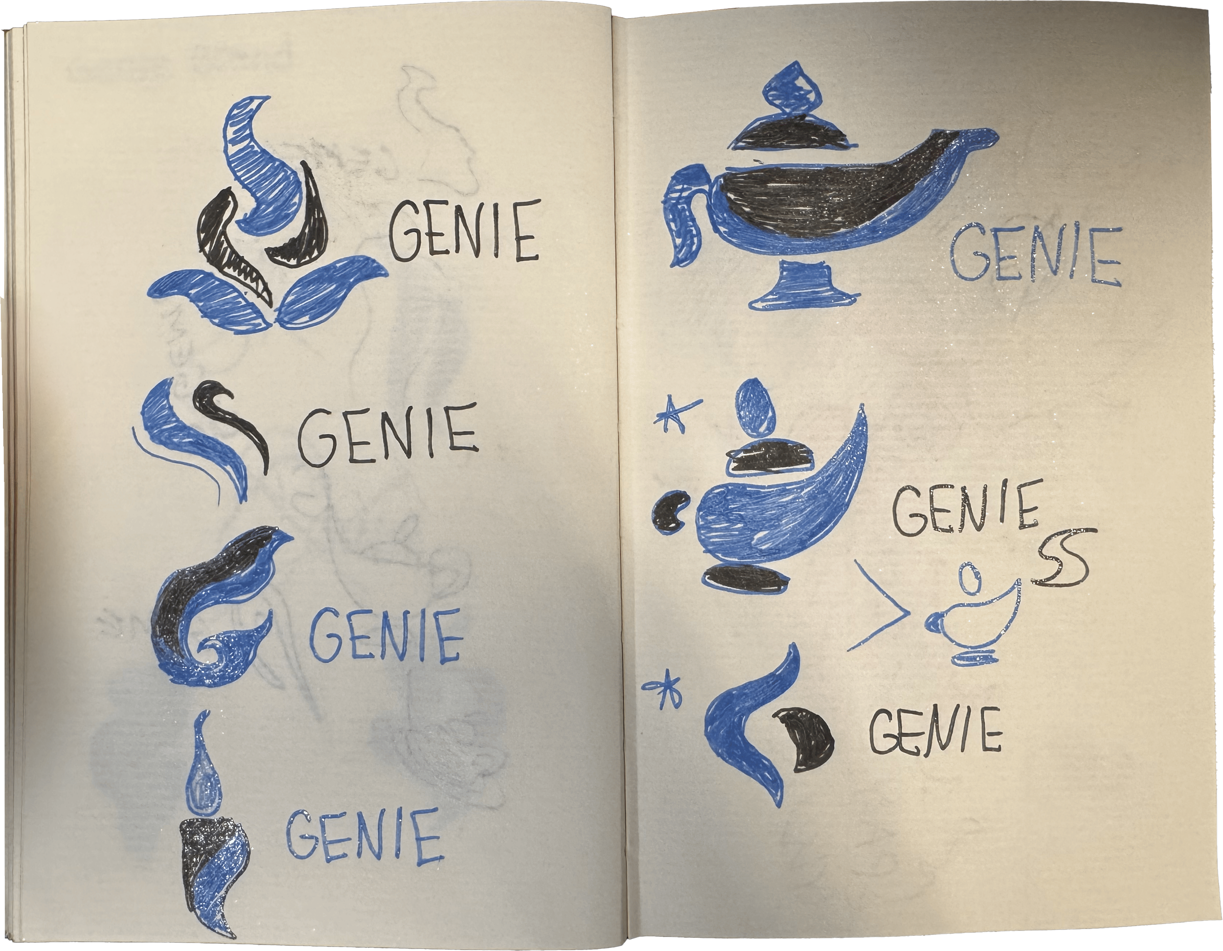
Sketch Variants
Secondary Logoss






Typeface & Color Palette
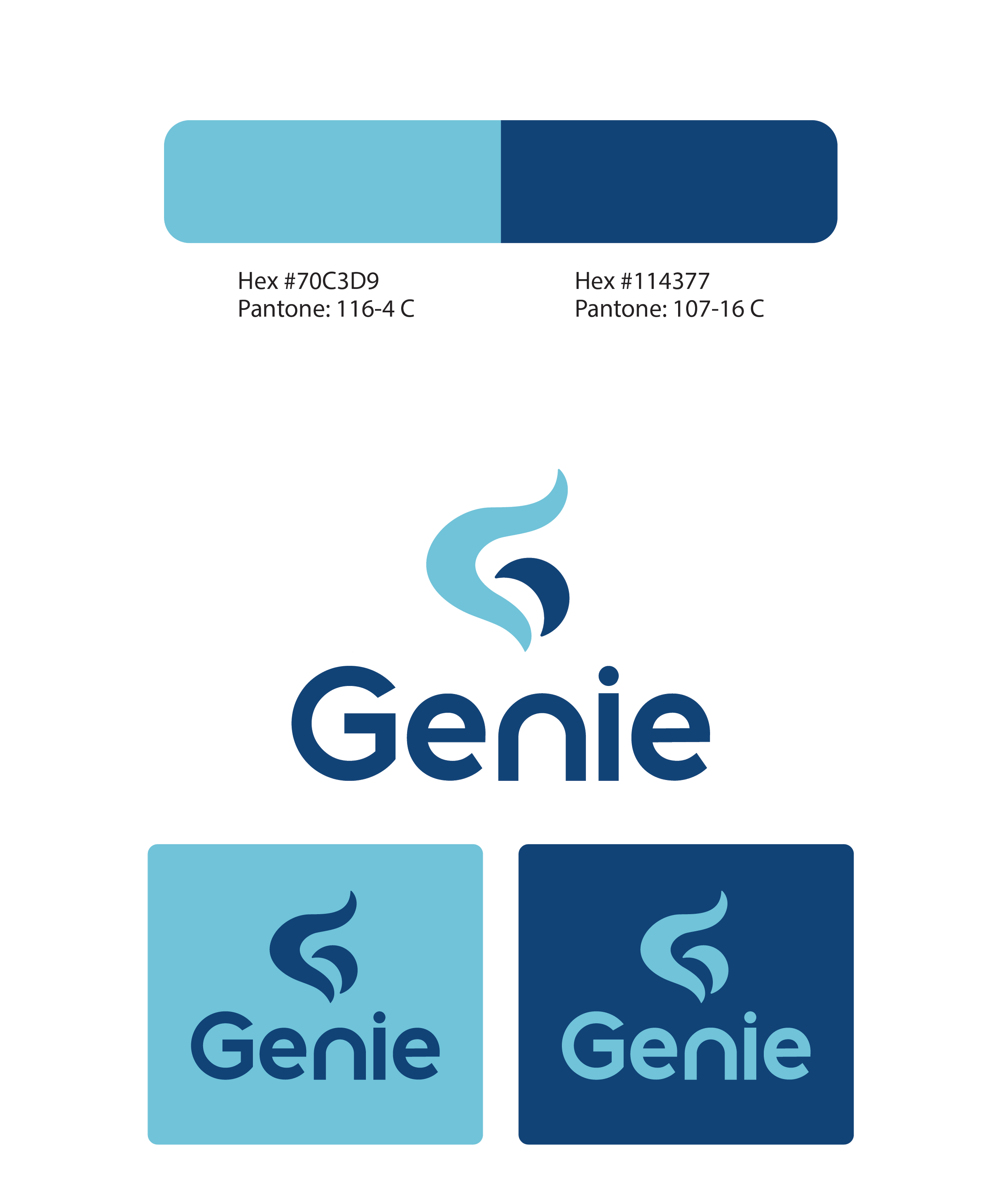
Color Palette
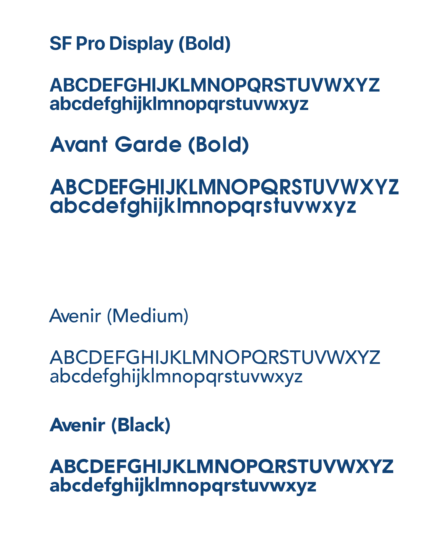
Typefaces

Starting with the star of the show: the favicon. I explored a range of variations to find a visual that could hint at the idea of a genie without without relying on the traditional aspects. Since this mark would appear across everything from the app to printed materials, it needed to be simple, recognizable, and flexible. After experimenting with many sketch variants, I landed on the letter “G” as the foundation. I designed around the letter “G” making sure to include fluid, wispy, smooth forms to suggest the idea of genie without literally presenting it. The logo itself was the word Genie, not steering away from the favicon but still pairing well when presented together and keeping that smooth flow the favicon has.
The colors that paired with the favicon couldn't be too different from each other as they would tie the whole logo together and would have to show on both dark and light backgrounds. With keeping the genie concept in mind, I chose a light baby blue and a slightly darker royal blue for the colors. These both would also represent the colors for the secondary logos. For choosing the typefaces, I wanted to keep the header a similar style to the genie logo and not go completely astray. SF Pro Display was a good font choice for this and I stuck with Avenir for the body text, which is PayCompass body text since Genie is a sub brand, I wanted to have something recognizable to the audience.
App Prototype
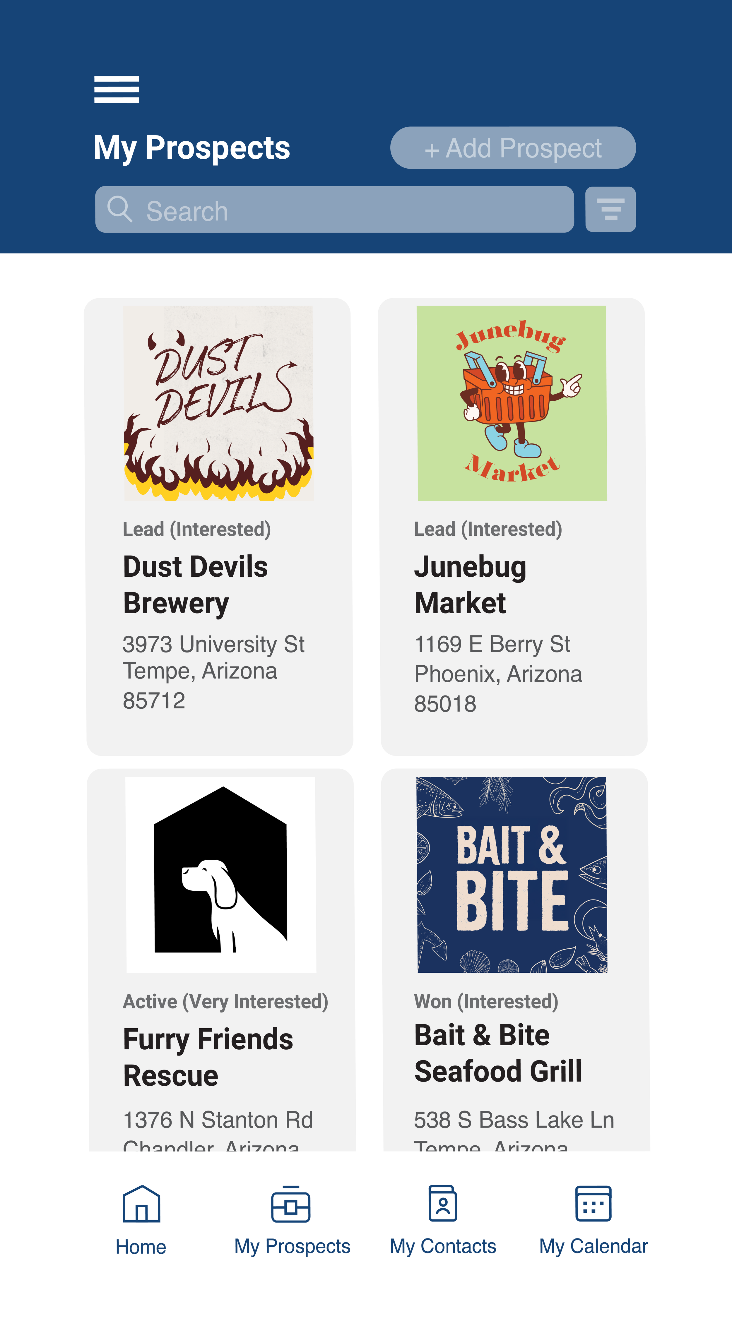
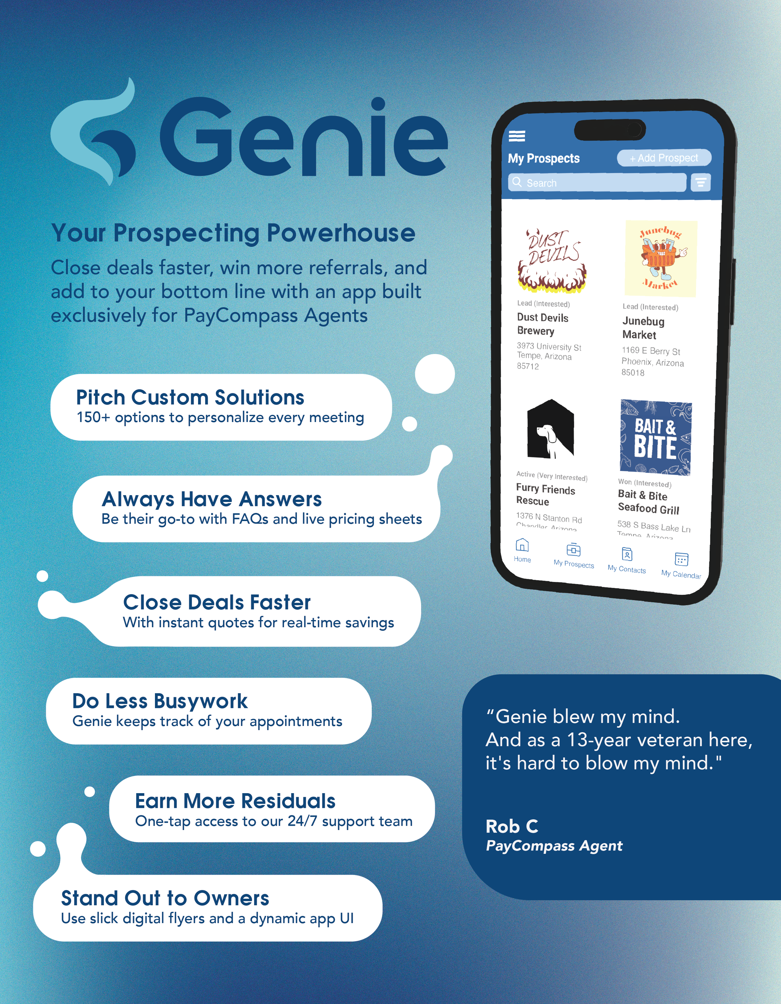
Genie App Mockup
3D Phone Mockup
Company Example Logo Designs

Prospect Profile Mockup
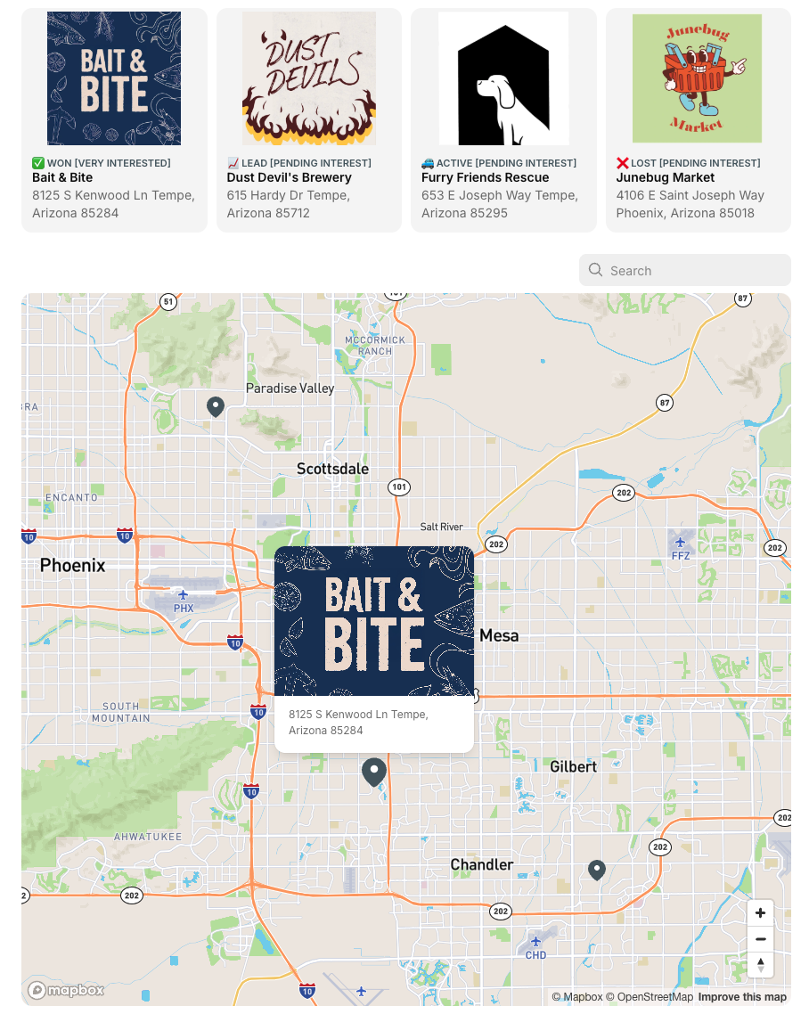
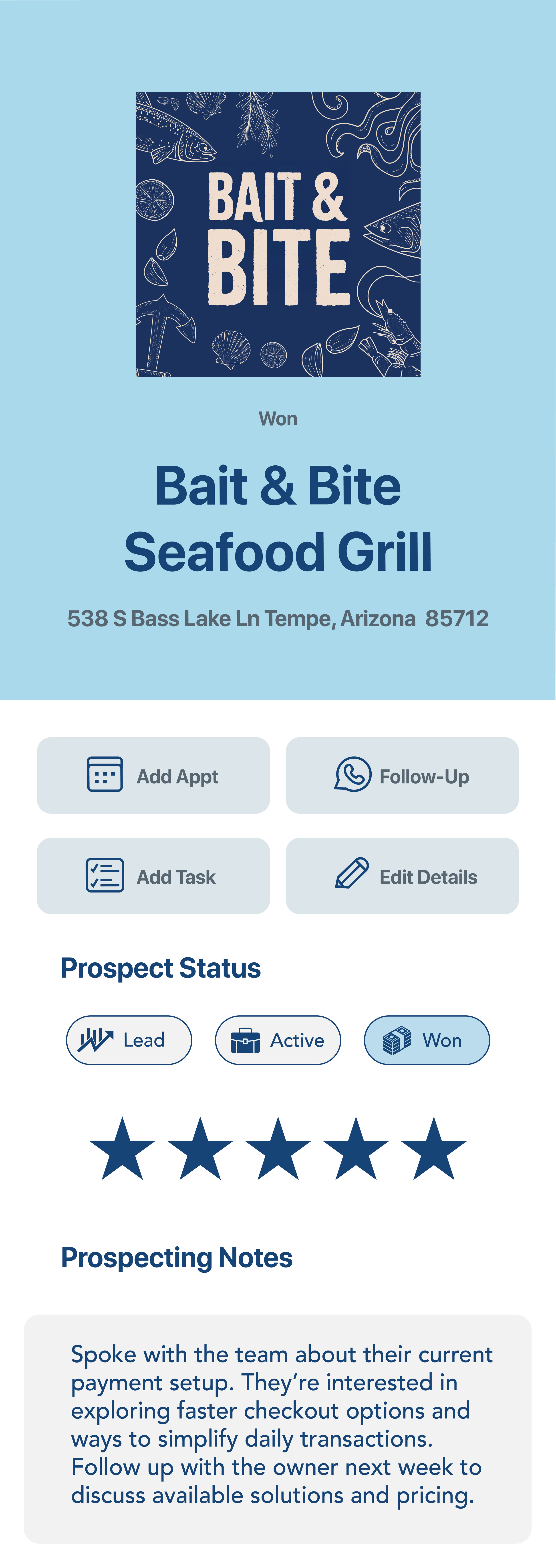
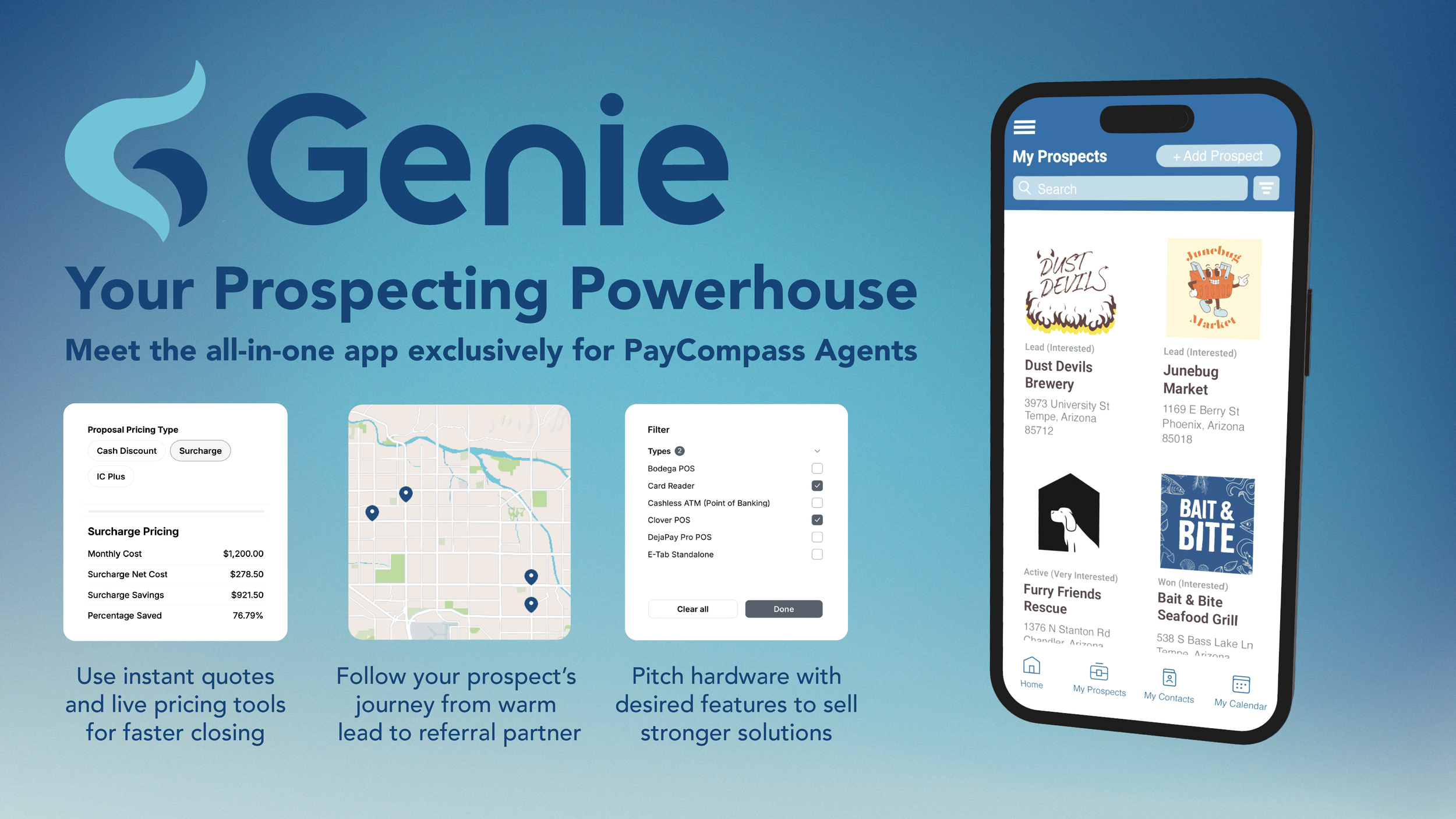
I was responsible for creating the visual experience for the Genie app, and what better way to bring the concept to life than by showing how agents could actually interact with this new helping tool? Since Genie was built around helping agents find prospects and close deals, I started with a dedicated space where agents could explore their prospects and access the information they need.
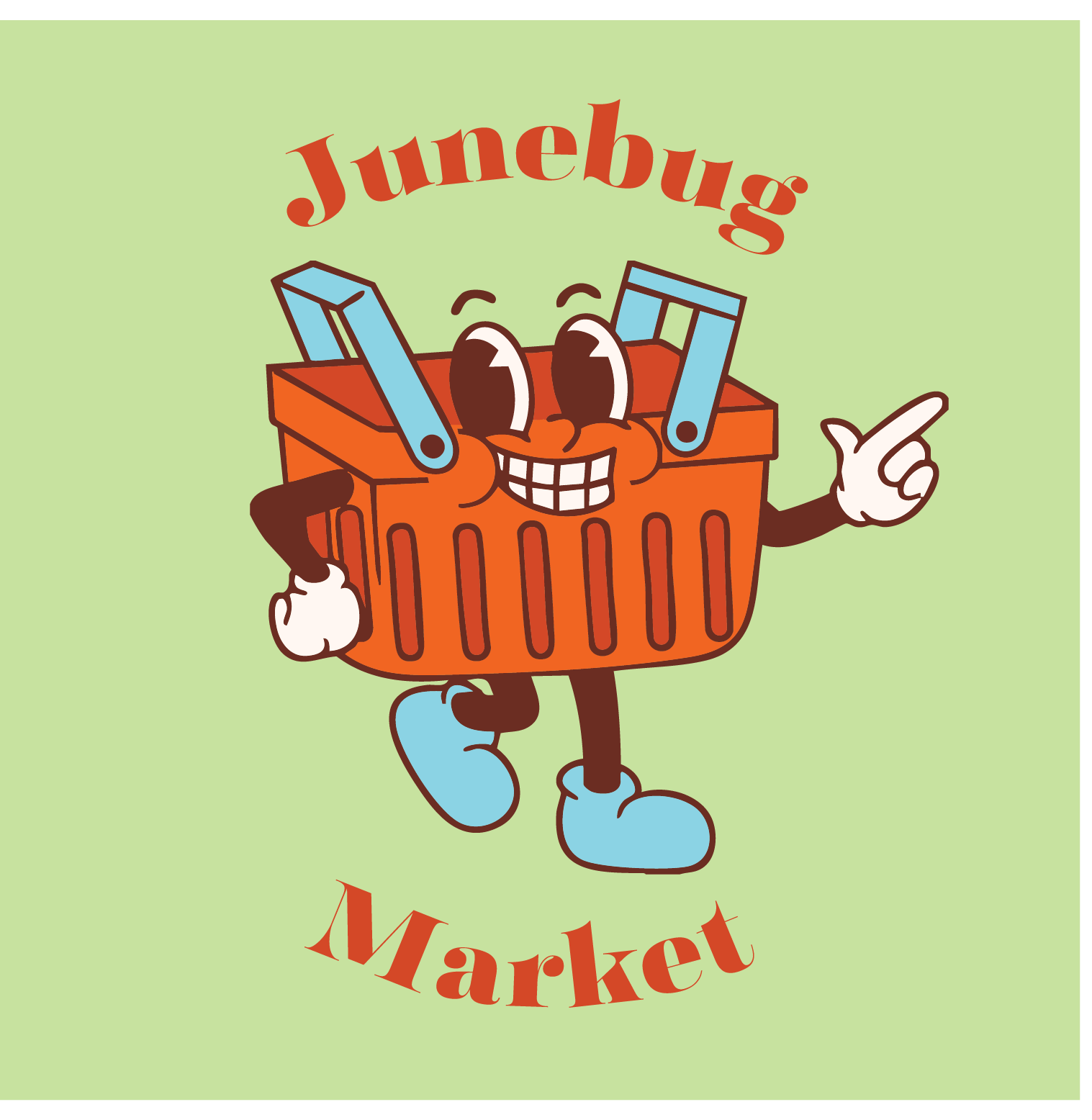
For the prototype, I created and illustrated fictional companies placed throughout nearby locations so they could come together within the app’s map experience. I intentionally gave each company a different industry to demonstrate the variety of prospects an agent could encounter, there’s no limit to where a new opportunity can come from!
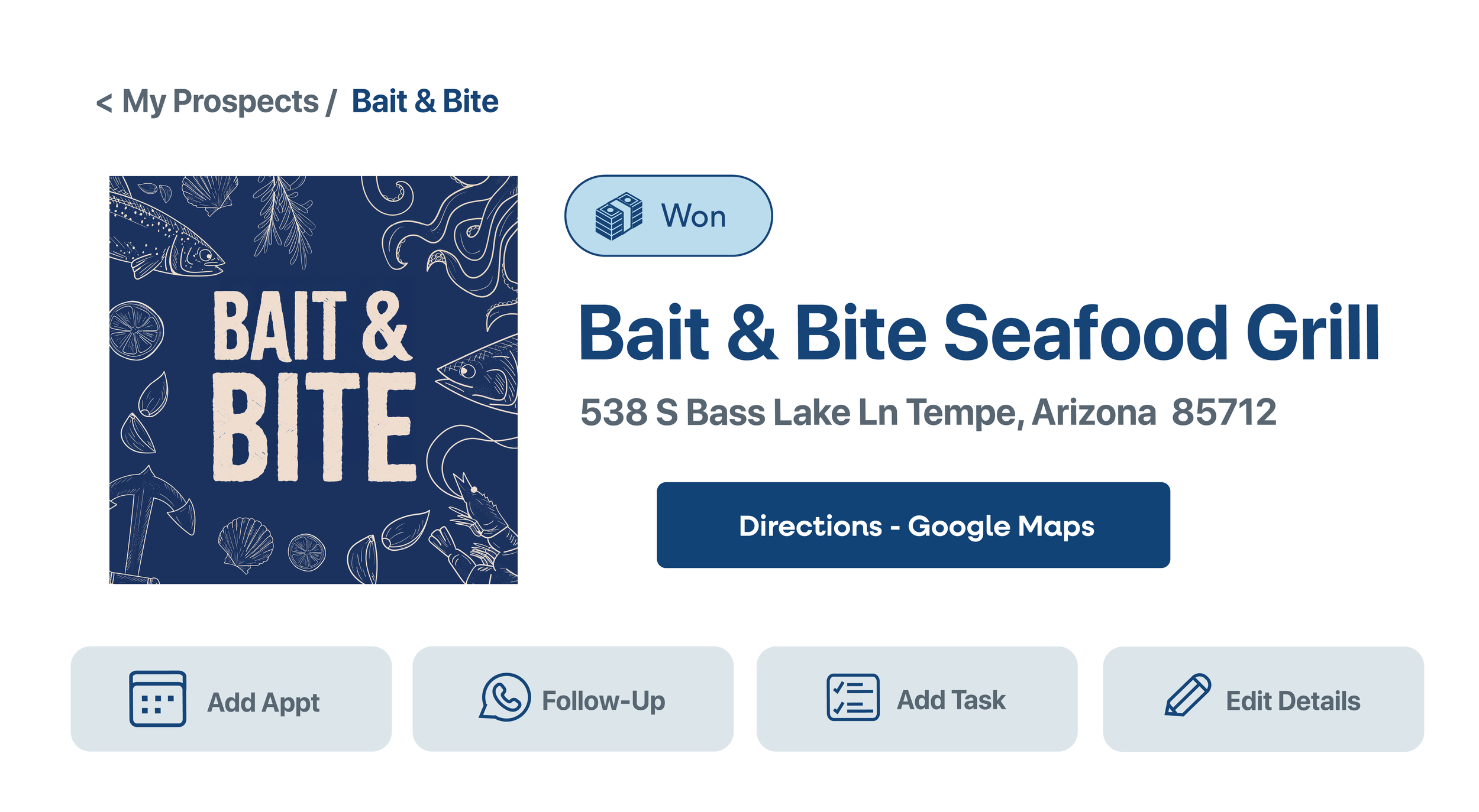
I also wanted to show that the Genie experience went beyond simply finding a company.
I designed individual prospect profile screens to demonstrate how agents could explore each opportunity, while giving the Genie brand a chance to come to life within the interface. Unfortunately the Genie app never made its debut, but these designs will forever live on and truly showed how the identity could translate into a cohesive digital experience!
Marketing Design