


Navigo was created as a centralized hub for PayCompass agents. They could board
new accounts, access internal resources, and manage important data. In other words,
one destination for everything. I was took what began as a written concept and
transformed it into a brand with its own personality, while still maintaining a visual
connection to PayCompass.
The challenge was finding a concept that would feel engaging and familiar while giving Navigo a world of its own. During the brainstorming process, one word continued to stand out to me: “boarding.” It immediately connected to Navigo’s purpose and opened the door to something much bigger. The core of the theme became clear: what if Navigo existed as its own galactic navigational universe? From there, the concept began to take shape. Agents would become the pilots of their own ships, boarding their vessel and navigating their way through accounts, resources, and everything else Navigo had to offer.
Logo
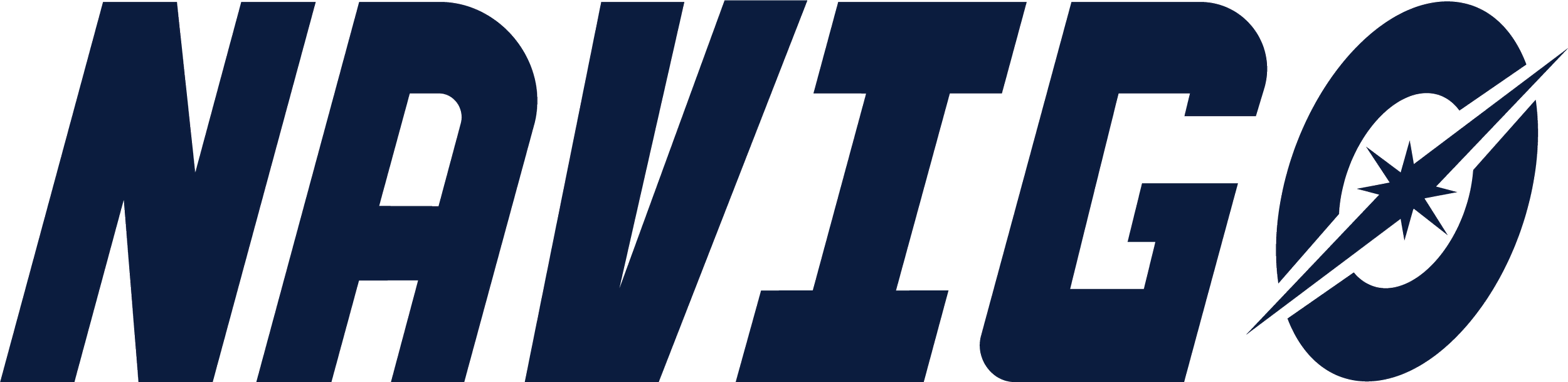
Primary Logo
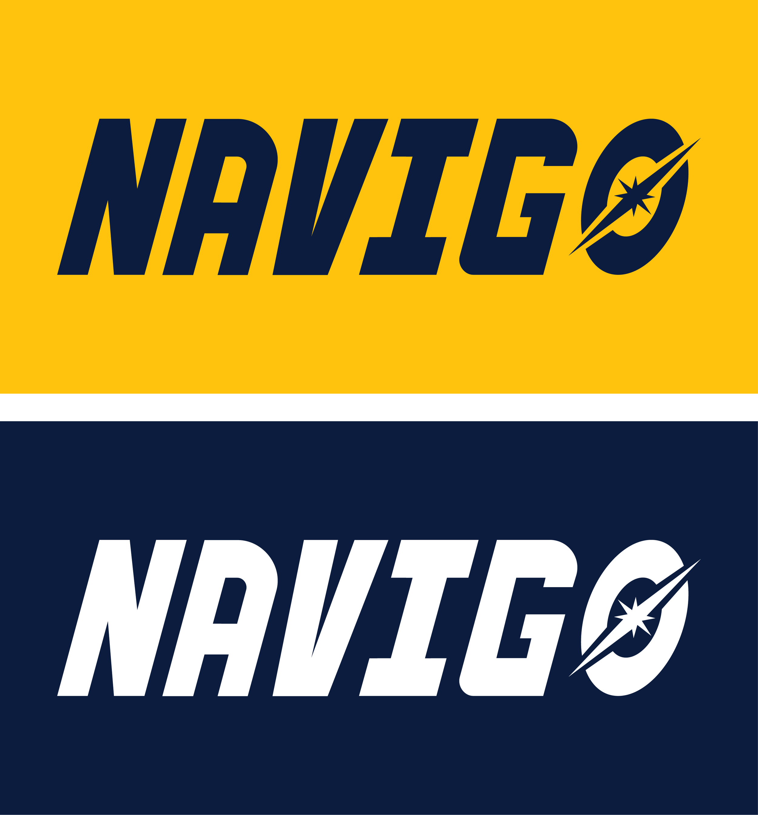
Logo Variants
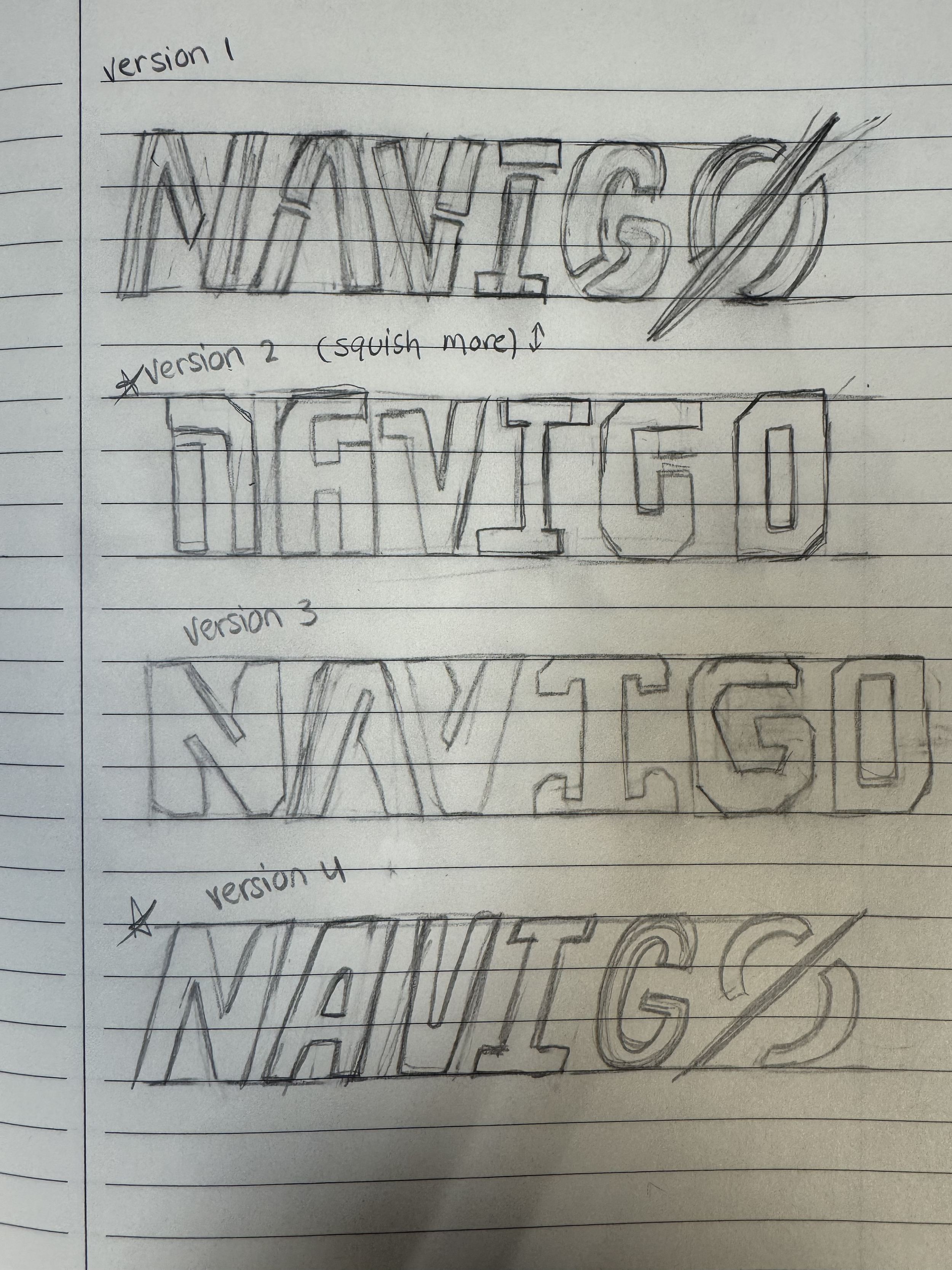
Sketch Variants
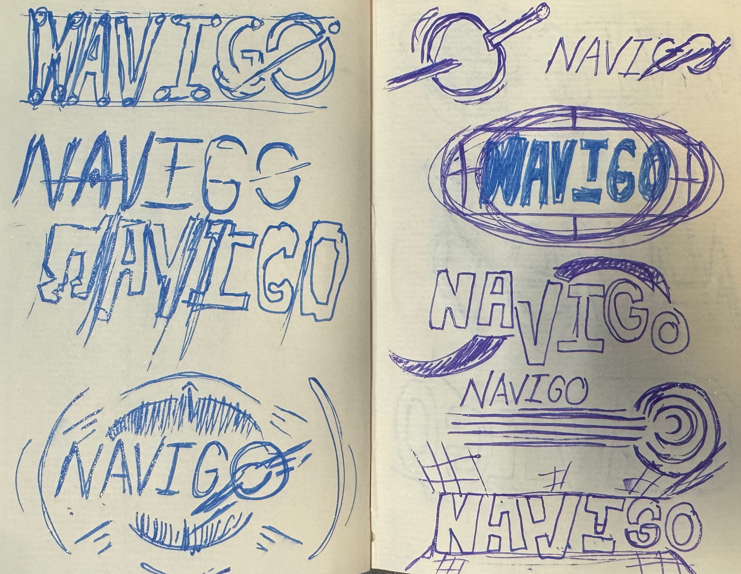
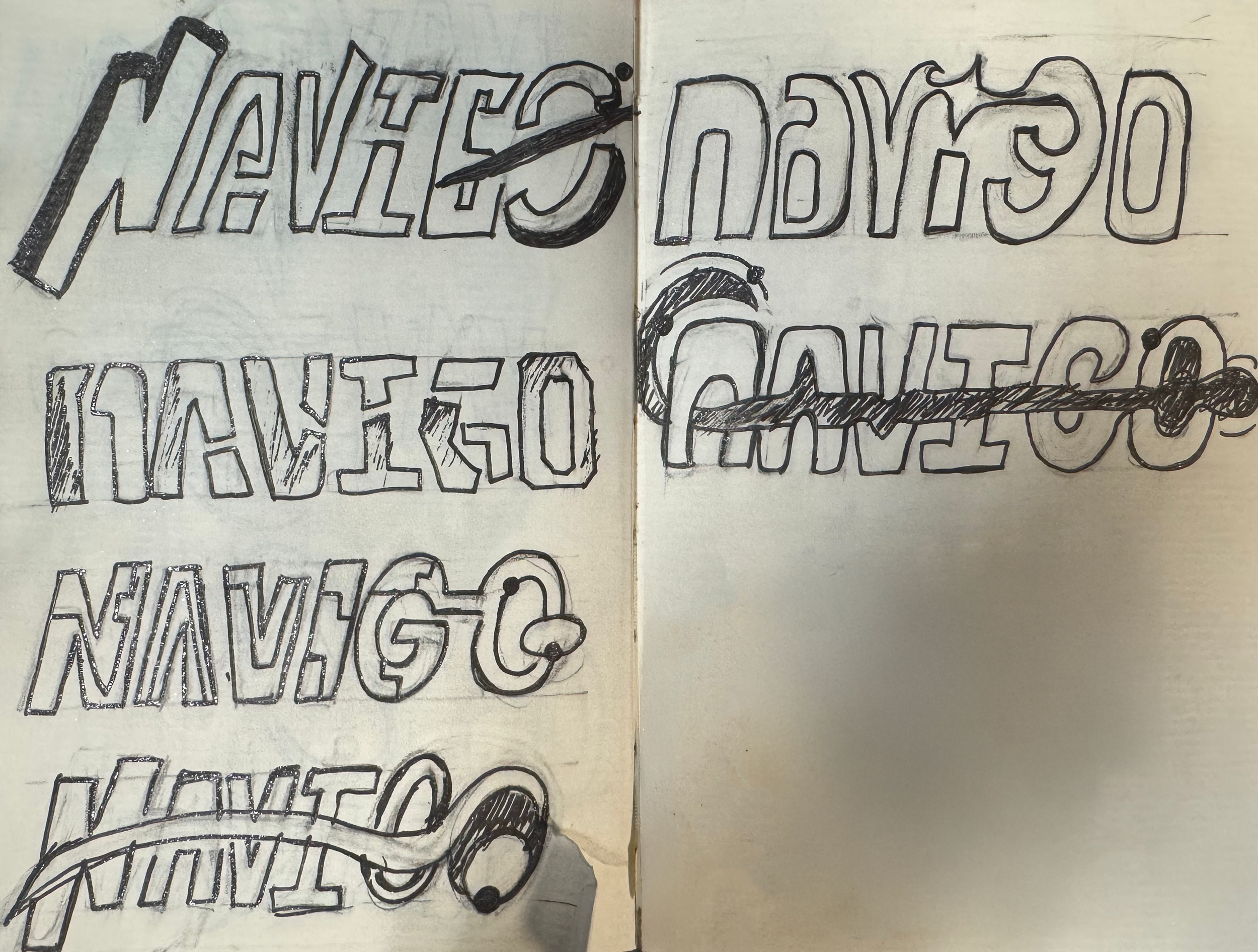
Creating the logo for Navigo would tie together the rest of the visual direction for its brand story. With the core theme established, I had to determine what kind of “space” I wanted Navigo to represent. I wanted a more sophisticated direction inspired by cyber science, blueprints, and spacecraft technology. I also envisioned the logo to have a slight slant to give it a sleek, forward moving feel while experimenting with the letter “O” as a distinct visual element without making it feel disconnected from the word mark. After sketching numerous variations, the direction evolved into a bold, clean, and modern logo, with a galactic star shooting through the “O” to create that final visual impact and really give it that wow factor!
Typeface & Color Palette
Typeface
Primary Colors
Secondary Colors
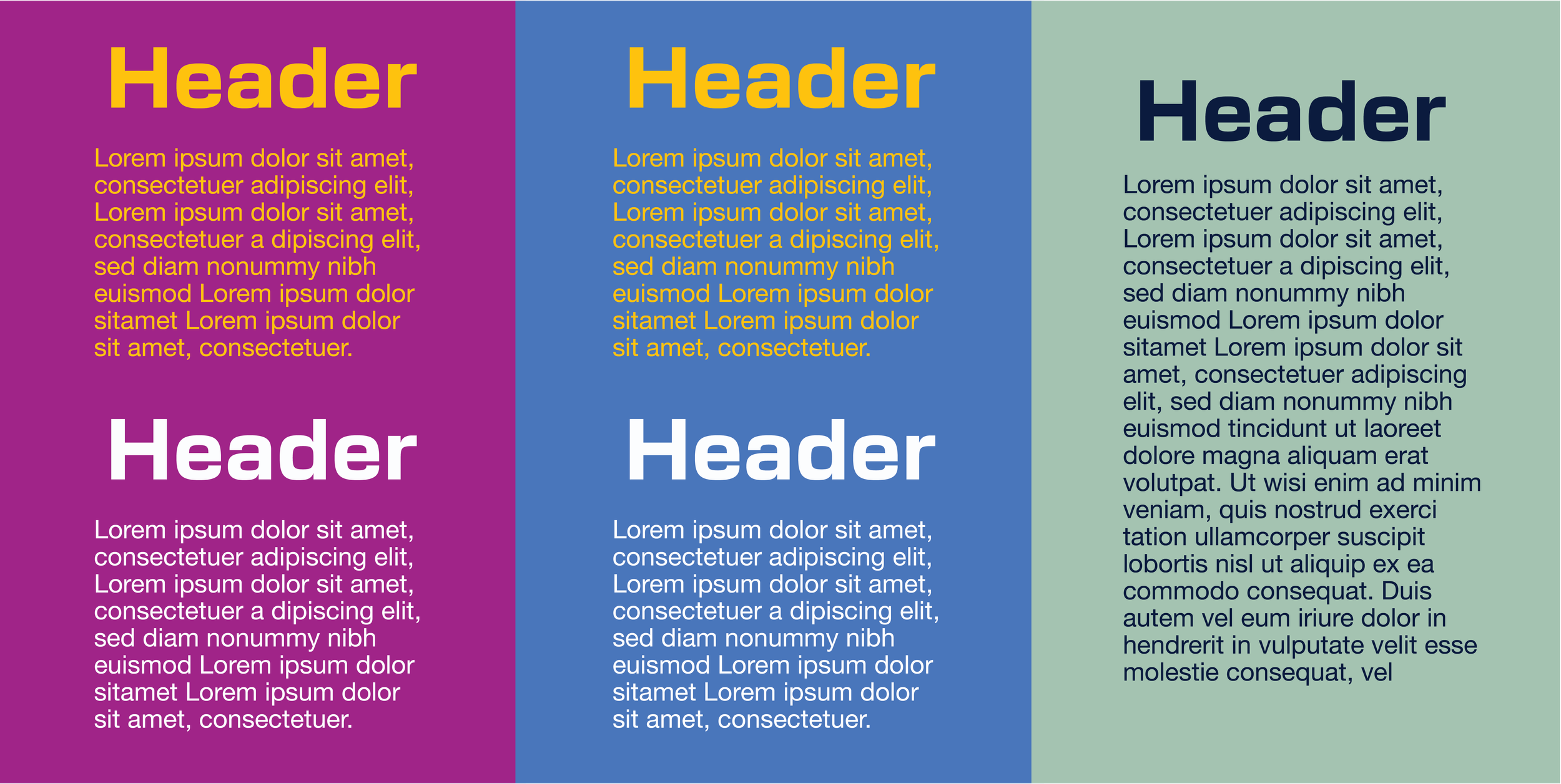
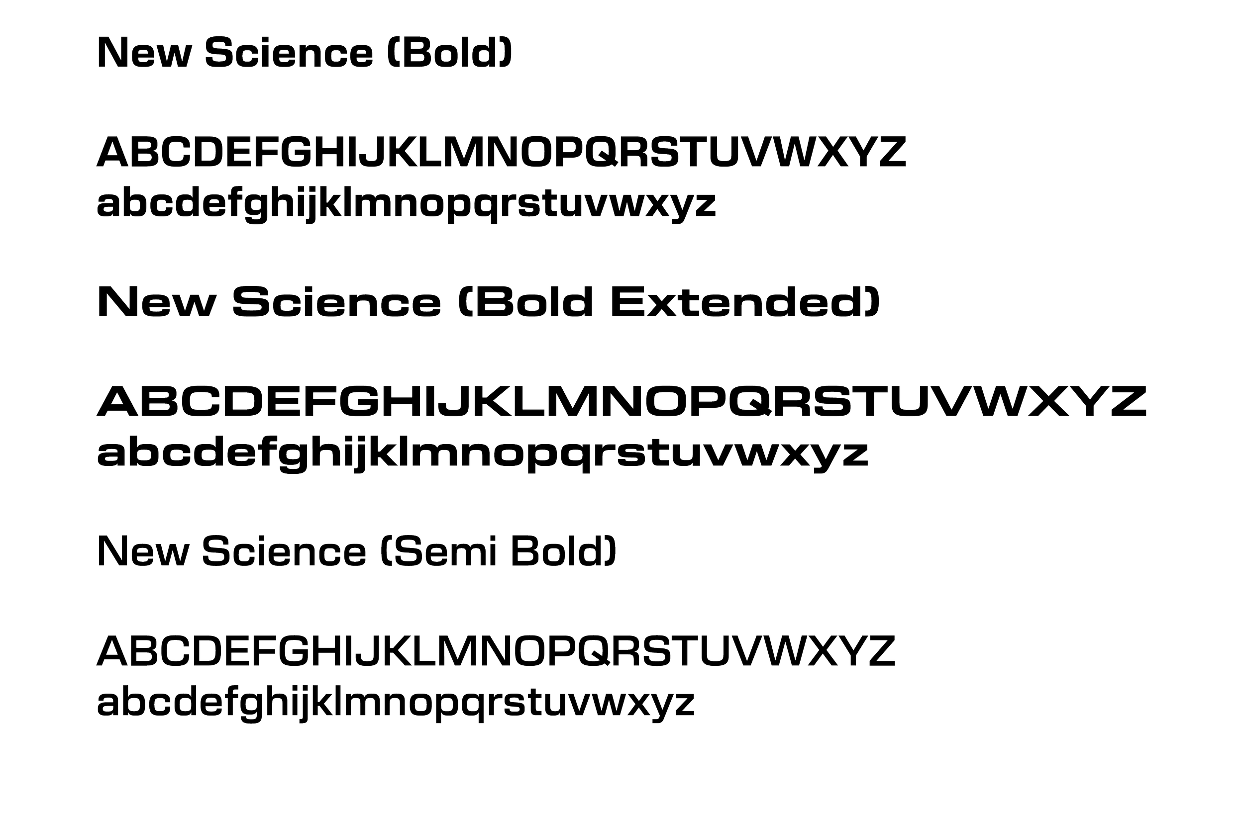
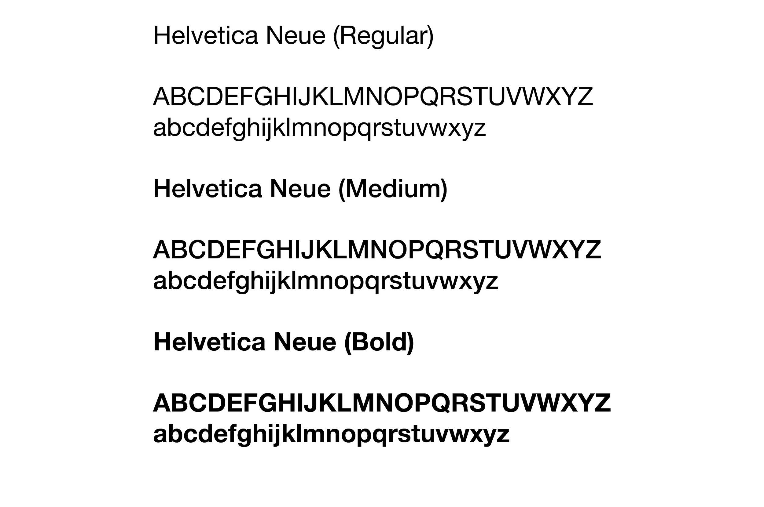
I knew I wanted the typography to feel bold, distinctive, and futuristic while still remaining apart of the brand. New Science Bold was a natural fit for the headers, giving the type a futuristic quality that paired well with the clean simplicity of Helvetica Neue for the body copy. Helvetica Neue’s familiarity and readability also allowed the headers to stand out without competing with the rest of the content.
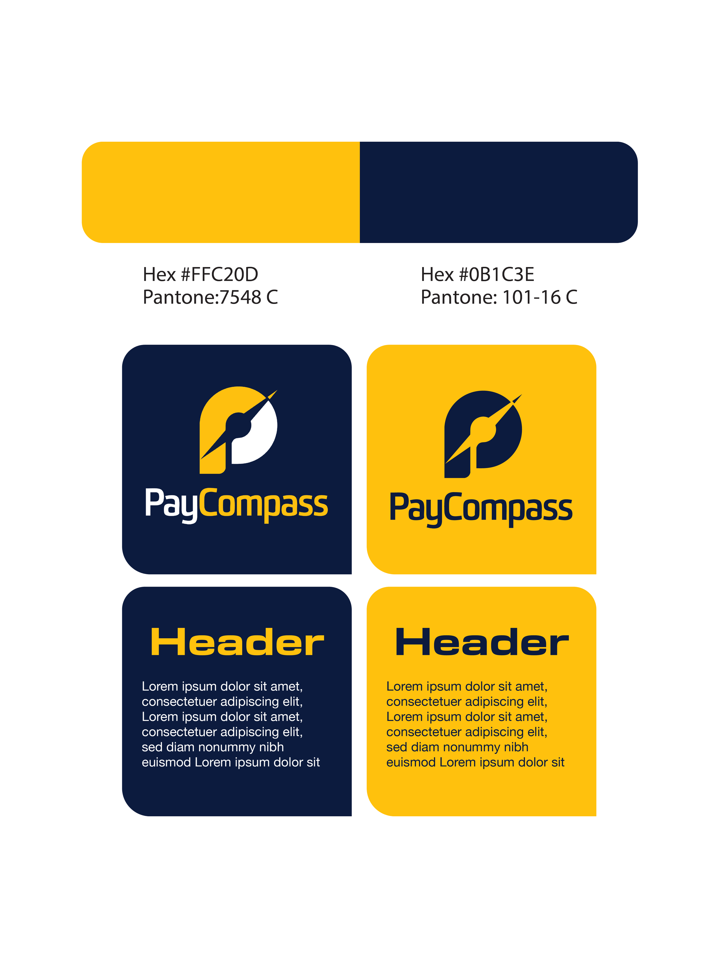
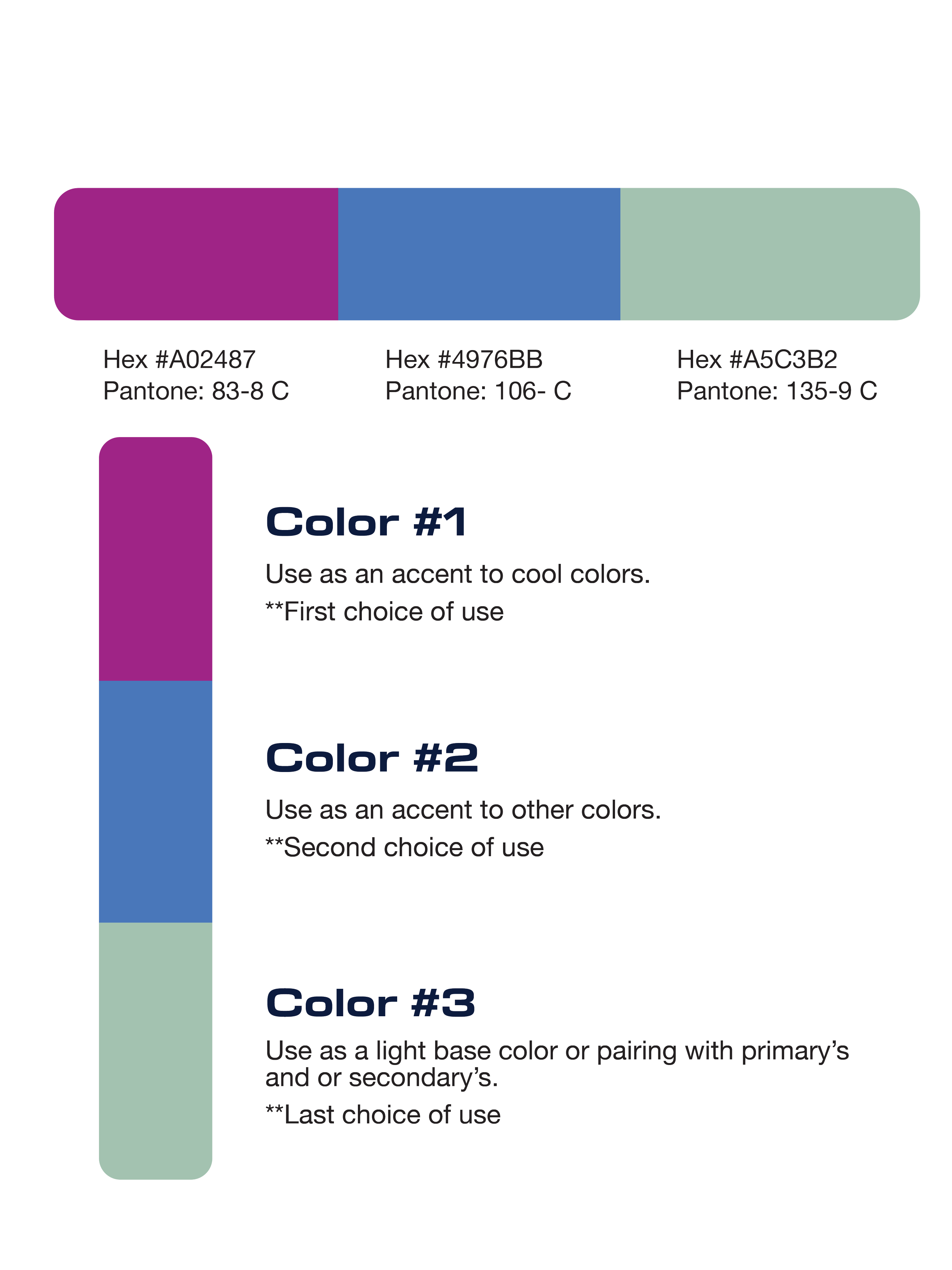
Since Navigo is a sub-brand of PayCompass, I didn’t want to stray too far from the established color palette. I kept the recognizable PayCompass yellow while introducing a new primary color: a deep navy blue that would compliment the logo, lighter text, and overall visual direction while creating a sense of the dark, open space surrounding Navigo’s world. For the secondary colors,
I wanted brighter, warmer tones that could stand out against the darker palette while supporting Navigo’s visual elements. For example, color #1, a bright magenta, added a strong pop of color alongside the blue and yellow, while also making it ideal for eye catching accents, symbols, and interactive elements such as button hovers.
Visual Exploration

Visual Brand Direction
Icons
Website Mockups
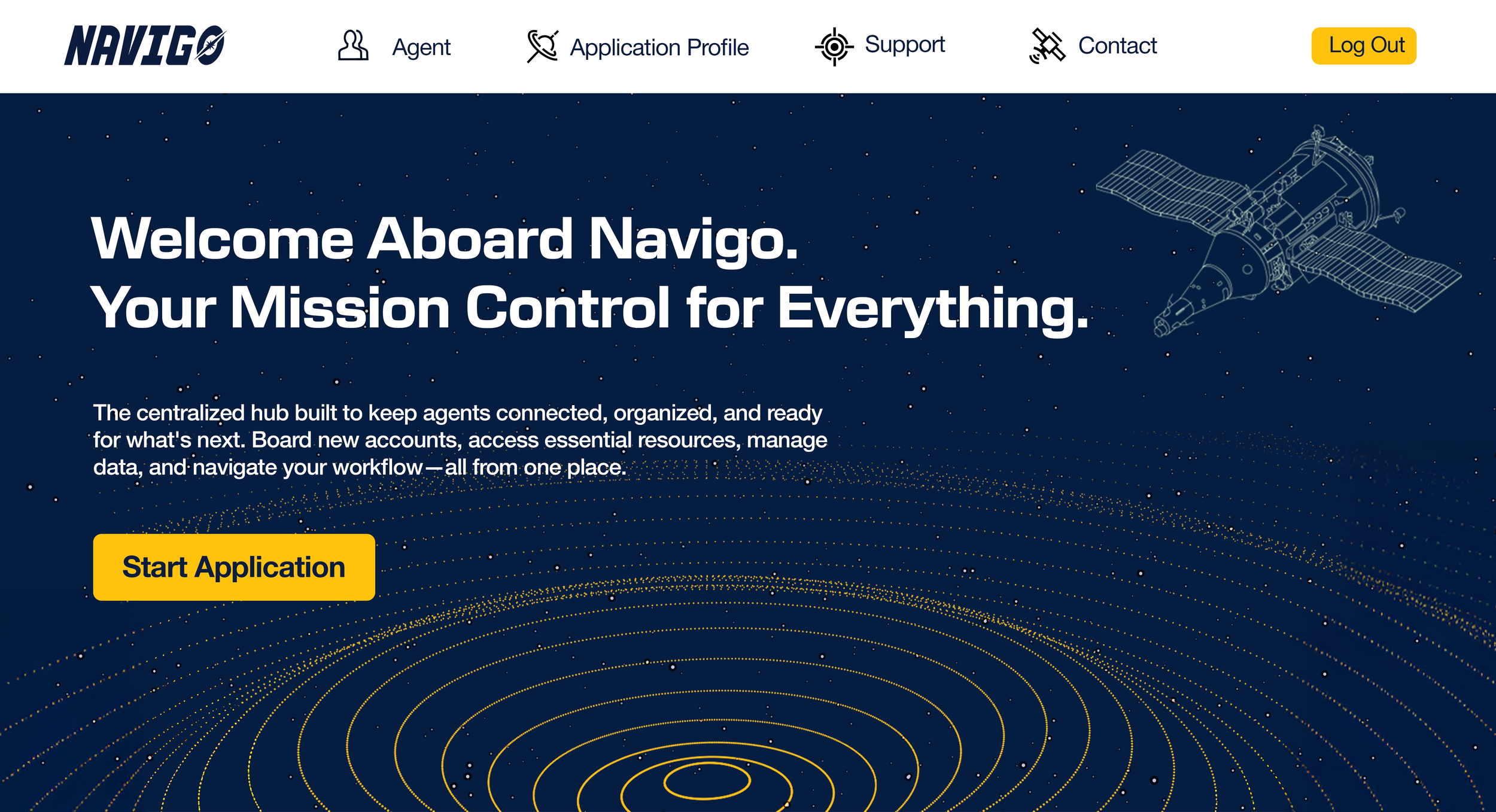
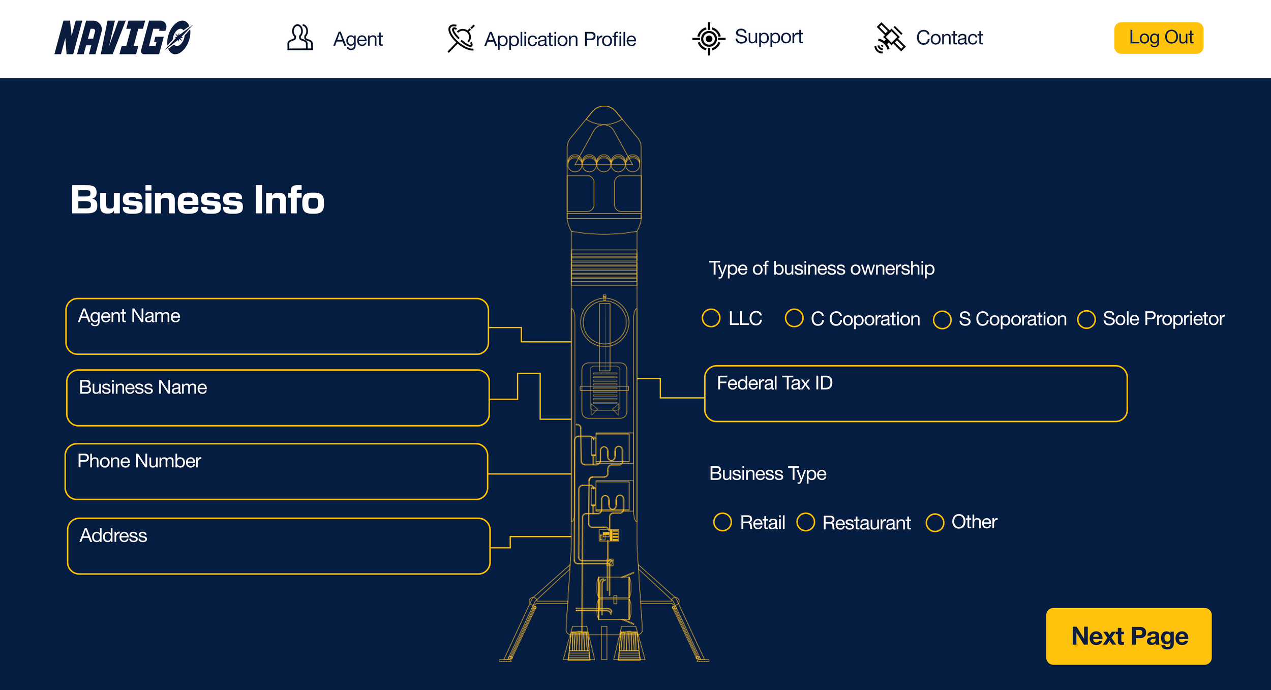
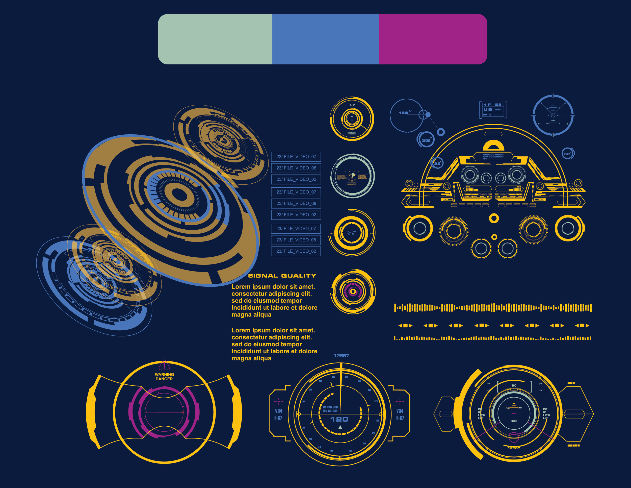
With the foundation of the Navigo brand in place, the fun part begins with visuals and mockups! I wanted to showcase the science and technology behind the Navigo
spacecraft through geometric visuals, spacecraft interfaces, and technical schematics. These elements helped establish Navigo’s visual universe while giving the color palette opportunities to bring personality and contrast throughout the brand.
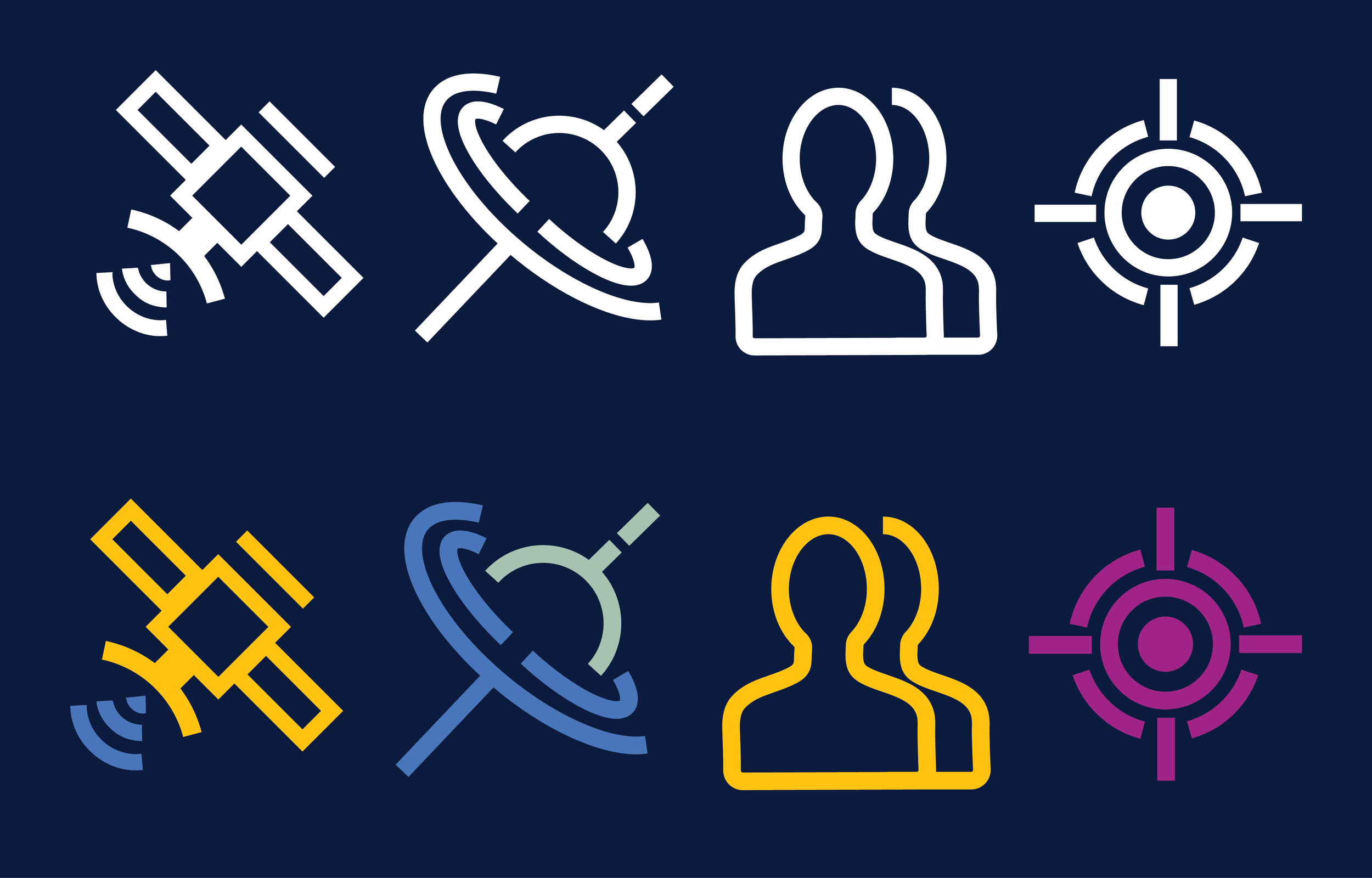
The icons I designed were specifically for a future Navigo website in mind, with each one
representing a key section of the experience: a human figure for Agents, an orbital path for Applications, a target for Support, and a satellite dish for Contact. Each icon was designed to work alongside its corresponding content while remaining flexible to be reused across other branding materials. They also created another opportunity to introduce those secondary colors through bold visual accents.
To bring everything together, I created website mockups that explored how the Navigo identity could translate into a digital experience. The goal was to show how agents could navigate through the platform while experiencing the same sense of exploration established throughout the brand. Although Navigo ultimately remained a concept and was never launched, these mockups helped visualize what the complete brand experience could have looked like in practice!